XIPAROS 1.0
-- created by Pia Frauss in 2005, with High Logic's FontCreator Program --
is a FREE FONT. I hope you'll enjoy it.
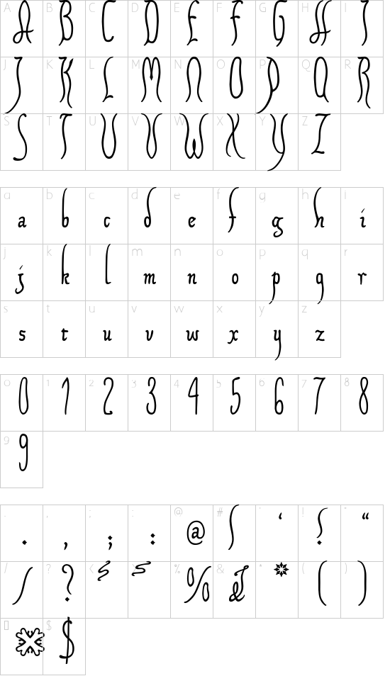
The XIPAROS font is sort of an extract of some German charters issued nine hundred years ago by the German emperor Henry V. Its lower case letters are rather genuine, if perhaps a bit more regular, and less edgy than the originals. However, I reduced the disproportions between upper and middle zone, and shortened the r to sit on the line. As for the upper case characters, I made them up myself out of the long s, trying to give a legible impression of those charters' more bizarre compositions.
There is are some of the contemporary decorations included in the XIPAROS font. However, they aren't attached to the glyphs. With one exception, they have to be typed like accents before the glyphs to which they belong, and you'll have to go for them on the following keys:
-- On the less sign, you'll find a zigzag line that works with b, k, and l.
-- On the greater sign, you'll find a zigzag line that works with f and h.
-- The + sign contains a little end swash that will look well after c, e, g, o, r, s, t, v, w, x, y, and z. It's an abbreviation sign that, originally, may have replaced an ending -s; but I've seen it at the end of expressions like moderno tempore, where it could mean nothing but decoration. This is the one and only of the font's decorations to be typed after the letter to which it belongs.
-- On the = sign, there is a little swash that will look well before words beginning with a, b, c, d, e, d, o, p, s, and t. Its original use was that of an abbreviation sign, applied before the p, and meaning the syllable pro; but I've seen it before other letters as well, even in the middle of a word, and don't have the least idea as to its meaning in those contexts.
-- On the left bracket, you'll find a little swash that will add a loop to the letter j.
-- On the right bracket, you'll find a little swash that will add a loop to the letter g.
-- The bar and broken bar sign contain an abbreviation sign of absolutely indefinite meaning, which will look well above every lower case letter except the i and j.
-- On the left curly bracket, you'll find a double loop to be combined with d, H, S, and ll.
-- On the right curly bracket, you'll find the double loop that should work well with f, h, l, k, and ...
... the long s -- which, of course, is occupying its usual place, on the number sign.
_________________________________
Disclaimer:
1. The designer as well as owner of this font is Pia Frauss.
2. This is a free font, but it is restricted to personal use only.
3. This font may not be included in any commercial compilation of fonts, be it on CD, disks or other products, without the owner's permission.
4. Altogether, this font may not be used for commercial ends and financial gain without the owner's permission.
5. This font may be freely distributed, as long as the zipfile, including this text, remains unaltered.
6. This font comes as it is. There is no warranty -- express or implied -- offered by the owner, or supplier. The risk of any losses or damages resulting from the use of this font remains wth the user.
For any information or permission you need, please write to [email protected]
|