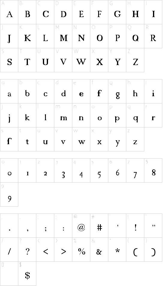
:: 字体包内容(18thCentury .TTF字体)
| 文件名 | 文件大小 | 文件类型 | 选项 | | 18cents.ttf | 12 KB | 字体文件 | 下载 |
| readme-18cents.txt | 955 B | 文本文件 | 查看 |
18cents - 18th Century font
made by me, douglas, so it's free.
I had trouble finding pictures of actual texts from the 18th Century,
I resorted to my history book, which had no Q's, Z's, and nearly no
punctuation, so I improvised. If you happen to run across an 18th
Century text, and find out that I screwed up the Q's or what not, sorry.
How to:
You'll notice the small S's look life f's. All small S's within and at
the beginning of words look look like f's. All S's at the end of words
looks like regular s's. I made left braces "{" regular S's. Also, I
made left and right brakets "[", "]"... "fi" and "si", because in the
old texts they sort of merge together or whatever. If you care, in
the 18th Century, they use italics for some proper names, change font
sizes alot, and throw in handwritten and gothic looking words sometimes.
oh, and when using all caps, put a space between each letter.
that pretty much cover's it. |
