NEW VENICE
FROM: Russ Rowlett
RussMSEN
[email protected]
RELEASE: August 1995
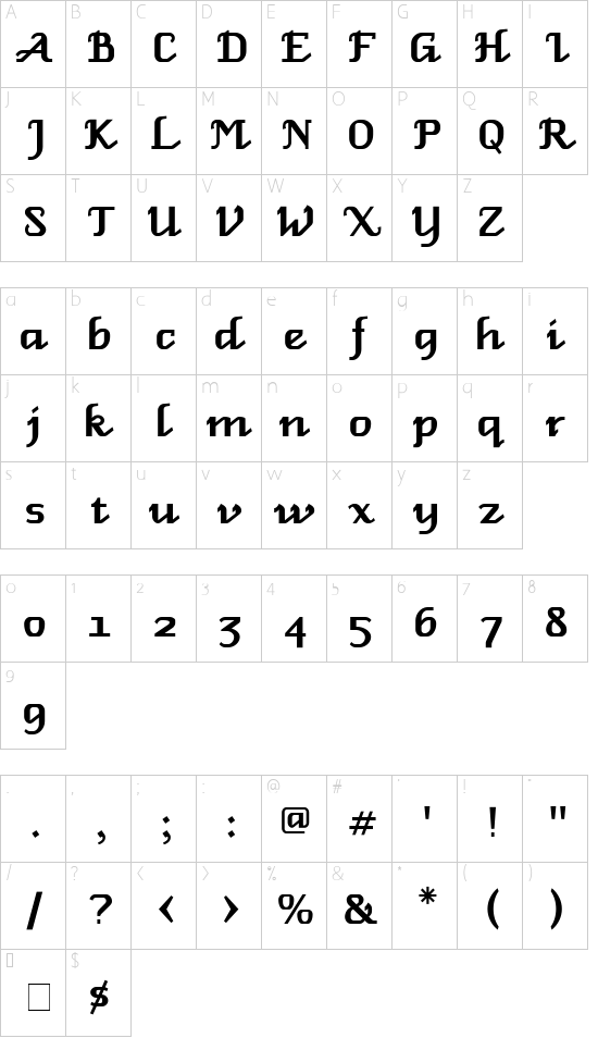
New Venice is a TrueType interpretation of the classic Macintosh bitmapped font Venice 14. Venice, one of the display and decorative fonts that used to be bundled with all Macs on the Systems Additions Disk, is a bold display font resembling a chancery script.
Venice was undoubtedly the most popular of the Systems Additions fonts. Although it was fancier than anything else available on the early Macs, it is very readable. All of us who used the classic Macs used Venice, and I still see the old bitmapped font on signs and certificates everywhere I go. Its biggest drawback was that only the one size, 14 points, was available. Well, here is this old Mac chestnut in a TrueType incarnation. You can use it at any size you like without any jaggies. And guess what? The design works fine at just about any size, from 12 points up to 72.
In creating New Venice, I followed the letterforms of Venice 14 pretty closely, but I made a number of changes to modernize the font. The numerals are old style, instead of the boxy, upright numerals of Venice 14. I�ve added many punctuation marks and special characters not supplied in the original, and I�ve provided a full set of accented characters.
The only characters missing are the independent diacritical marks and some of the non-ASCII commercial, mathematical, and technical signs. To hold some of their places I have designed several special characters which may be useful in certain display settings. These include:
Ordinal abbreviation st (as in 1st) at option-H
Ordinal abbreviation nd (as in 2nd) at option-J
Ordinal abbreviation rd (as in 3rd) at option-K
Ordinal abbreviation th (as in 4th) at option-L
English long s at option-B
Solid lozenge-shaped bullet at shift-option-V
Fraction 1/2 at shift-option-2
Superscript e (useful for setting �Hear Ye!�, etc.) at option-5
Single tick mark (meaning �feet� or �minutes�) at shift-option-E
Double tick marks (meaning �inches� or �seconds�) at shift-option-G
The fi and fl ligatures are omitted because the font has a non-kerning f. The standard ae and oe ligatures are included.
Only the roman style is included. However, because of Venice�s simple, upright design, the algorithmic italic style of New Venice generated by many printers actually isn�t bad at all. Give it a try.
A note about line spacing. The fonts on the old Systems Additions Disk all set large for their stated point sizes. I wanted New Venice to have roughly the same size lettering as Venice 14 when set at the 14-point size, so I had to make its lettering comparably large. This will not be a problem in most cases, because most word processors will adjust the line spacing automatically and appropriately. However, if you need to control line spacing tightly, specifying the exact number of points between lines, then you should allow New Venice line spacing to be at least 133% of the point size. (For example, 12-point type needs 16-point line spacing.) Otherwise you may observe overlapping lines or clipped characters.
New Venice is freeware. It is not in the public domain. As an individual user, you
have permission to make copies for all your kith and kin, provided you follow
two rules: (1) all documentation files must be copied along with the font
suitcase, and (2) nothing whatsoever can be charged for copies of the font. All
other rights reserved.
I hope you enjoy and use the font. Comments via e-mail are welcome.
|